Read Time: 6 Minutes

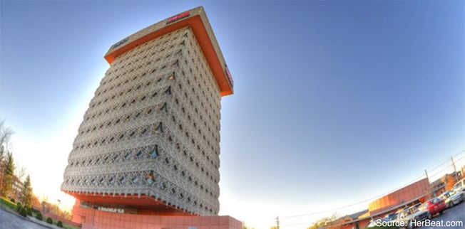
If you’ve somehow managed to never fall victim to bad design (I don’t believe you) then it’s at least certain you’ve seen it. The example that always comes immediately to mind is an eye sore of a building in nearby Louisville (picture above) called the Kaden Building. Is is perhaps, the ugliest building I’ve ever seen and I involuntarily curl my lip in disgust every time I pass it. Who designed this building? None other than Frank Lloyd Wright.
For anyone that doesn’t know who Frank Lloyd Wright is, it’s worth taking a second to pull him up on Wikipedia. He’s a famous American architect who designed over 1,000 structures including his most famous, the Fallingwater house. Over 500 of those designs were actually created. And in fact, your town, like mine, might even be the “lucky” home of one of his designs. The thing is, while Frank Lloyd Wright’s designs were inarguably beautiful, they were crap.
Form Over Function Does Not a Fab Home Frame
Our buddy FLW mastered design, but failed the functionality test in almost every possible way. Ask any owner of an unrenovated FLW building and they’ll give you a laundry list of malfunctions on the house which will include, but isn’t limited to: soft foundations, leaky and or unsupported roofs, use of non-durable materials, energy inefficiency, and poor drainage systems. Read more about that here.
So while these buildings were pretty (with the exception of the Kaden Building) they were basically non-functional, which brings me to my main point. As Bruce Fox falls somewhat unneatly somewhere in the promotional products industry,
we are regularly confronted with just bad design found most often as “swag” (aka s**t we all get).
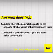
So we’re sometimes put alongside some of the stuff with terrible design much like like what’s seen below.
 |
 |
 |
| Sinks in the UK | The Norman Door | The NOKIA N-Gage |
While it’s actually a little entertaining to look at bad design, the examples above are mostly disposable. What happens when you’re given a product with bad design that’s meant to stick around a little longer like a house, car, or (unapologetic plugging) a custom award?
The Easy Way Avoid Bad Function and Form
There are two ingredients to this:
- Possessing or relying on someone with experience
- Asking lots of (the right) questions
To create a product with both functionality and aesthetics, what will be your biggest asset is plain old experience. You don’t necessarily have to have it yourself, though. Obviously the ideal situation would be asking an expert with years of experience in studying (and making their own) design mistakes. But depending on what kind of project or product you’re working on, this might not be feasible. The more daily application of this is asking friends, coworkers, family members, random people on the street, to give you feedback on your product or idea. But be careful about relying too much on people that love you, because sometimes they’re more inclined to point out the things they like than the things that don’t quite work.
Eventually you’ll be able to rely (mostly) upon your own experience, but don’t fall victim to the Frank Lloyd Wright Syndrome and lose sight of what your customers actually need. This brings us to the second ingredient.
Interested in learning about Employee Recognition? Read The Definitive Guide to Employee Recognition Free Employee Recognition & download the free toolbox!
To truly understand your customers and product, you need to ask as many questions as possible. If you’re testing a product, be sure to press especially hard upon your close friends and family to give you honest thorough answers by asking open-ended questions. If you’re talking to a customer, use open-ended questions to find out more about them, their company and their needs.
Take the time to get to know your customer as much as they’ll allow, because any information you can get will help you better understand their unspoken needs.
Perhaps the best and most relevant example to this was, when after talking in-depth to a client who intended to order wall plaques to recognize their top salespeople, we began talking about company culture and even the structure of the building itself. We asked, “Wait. Your salespeople work in cubicles?” The client responded with a hesitant “...yes?”. We pointed out to them that instead of the wall plaques, which wouldn’t be able to be displayed on the short soft walls of their cubicles, they might want to consider letting us design something that can be displayed on their desks.
In this case, it helped having nearly 80 years of experience with design and manufacturing. But it wouldn’t have served the client properly if we hadn’t taken the time to ask the right questions.
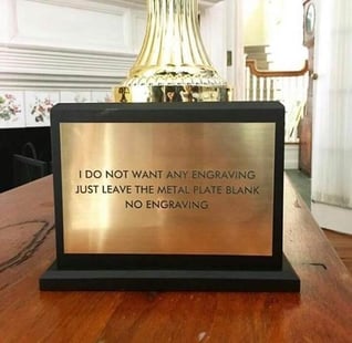
In a lot of cases, customers fall victim to “experts” that overextend themselves or overestimate their abilities. Particularly in our industry, manufacturers are forced to pander to the microwave phenomenon of “I want it now”, and try to get products out quickly and cheaply to satisfy their customers, but form and function fall victim to the haste. And you get stuff like this:


Wright Did Do Something Right
I really do hate on FLW every chance I get (especially now that I live in a city with perhaps the only ugly FLW building) so I was pleased when I realized I could use him as an example here. But the truth is, there is something to be learned from the guy. After years of vigorous head shaking in his general direction, I realized he actually taught me a lot about design-- both how important it is for something to be aesthetic, but also how important it is for what you make to actually work. He taught me that you can’t just present yourself as an expert and go headstrong into a project with a cavalier sense of “I know what’s best”. So, if you want to be the expert your customers can rely on to deliver on form and function, slow down and ask the right questions or rely on another expert (hint, hint) who knows what to ask.
If you're interested in learning more about Bruce Fox or employee recognition please consider following us on Facebook, Twitter, or Linkedin or subscribing to our blog here!
| Bonus Stuff: If you can’t tell, I really like good design. It’s something I’m really passionate about because from a young age my dad encouraged me to be a tinkerer. I’m obsessed with optimization and improving, improving, improving. I even take simple things like how do I make this thing that I use daily more accessible but still aesthetic. But once I find a solution for it, I ask, “but how can I make it even better?” With that being said, if you’re as passionate about this stuff as I am, I’d like to introduce you to two things: the Astiankuivauskaapp and the podcast 99% Invisible. You’re welcome. |
Kaden Tower Hero Image Photo Credit: Wikipedia
Tap Water Photo Credit: StareCat.com
Norman Door Photo Credit: Vox.com
Nokia Photo Credit: Slideshare
Trophy Falling on Head photo Credit: Mandatory
Too Literally Trophy Instructions Photo Credit: BuzzFeed
Ronaldo Statue: People.com
 Arianna Thayer (found sleeping here) is the disembodied voice of the Bruce Fox social media pages, emails, and occasional blogs. She's new to Bruce Fox, and a recent New Orleans transplant to the Louisville area. In her spare time, you'll find her walking her dog Luna(tic), throwing dodgeballs, or playing trivia with her friends.


